Tutorial of Data Analysis in Python + Jupyter Notebook
“Torture the data, and it will confess”
— Ronald Coase
You’ve probably heard “Data is the new oil”.
Yes, in the 19th century the industrial revolution happened because of oil. A similar industrial revolution is happening in the 21st century because data and Data Analysis is a key aspect of this revolution.
In data analysis, there is a term – Exploratory data analysis (EDA). It’s “The first look at data”.
We often make assumptions about a business and figure out a few conjectures. I have used the word ‘conjecture’ and not ‘fact’ intentionally. Because your view will remain a conjecture unless it has a firm base. EDA is a methodology where we visualize the data using different charts & graphs and they provide an affirmation to our hypothesis.
The standard definition of EDA is – The process of visualizing and analyzing the data to extract insights and understand the dataset in a better way.
In this blog, I am going to show you the process of EDA through analysis using python libraries like pandas, seaborn, and Matplotlib.
The bank Customer Churn dataset is available here
Goal
Before we proceed to the solution, we will understand the problem statement and its goal. Assume we have a client ‘ABC Bank’. The bank has noticed an increase in the number of customers leaving the bank.
To tackle this alarming situation, the bank decided to collect data for the past 6 months. 10000 customers were selected randomly from three countries – France, Germany, and Spain. The bank wanted to get insights about customer churning so the bank can upgrade or adopt new policies.
Installation
Before starting we need to install the libraries we are going to work with.
Open the terminal and type in the following commands-
pip install pandas
pip install matplotlib
pip install seaborn
We will be using Jupyter notebook IDE for EDA.
In your terminal type in the following command to install the Jupyter notebook –
pip install jupyter
After installation, to use the libraries import them by typing in the following in your Jupyter notebook-
import pandas as pd
import matplotlib.pyplot as plt
import seaborn as sns
%matplotlib inline
You may be wondering what pd, plt and sns are. It’s an alias name for the libraries.
For full access to the notebook here.
Descriptive Statistics
Descriptive statistics help us to get insights from the data that are not obvious. To print the dataset we use .head() which is a function of the panda’s library. It shows the top five observations of the data as follows.

Here, we have read .csv file using .read_csv() method of pandas. The file which we read here is stored in the data frame. The data frame is a datatype of the pandas in simple language we can say it is a tabular representation of data.
Various columns of the dataset like Customer ID, Credit Score, Geography, etc are shown above.
A quick look at the dataset tells us that the columns RowNumber, CustomerId, and Surname will not make any difference on the customer’s decision to leave the bank.
Geography, Gender, NumOfProducts, HasCrCard, and IsActiveMember are Categorical variables and the remaining variables i.e. CreditScore Age, Tenure, Balance and EstimatedSalary are Numerical variables
Here the Exited column contains 1 or 0 values. 1 means the customer is churned or has left the bank, 0 means the customer is still associated with the bank. So here we have to consider Exited feature as a targeted feature because this feature tells us about customers leaving or not. We have to do an analysis by taking this important feature into consideration.
I have written a customized function that returns the customer churn percentage with respect to each country.
Using that you can understand that Germany has a maximum churn percentage which means the maximum number of customer churn is from Germany then Spain and France.
You can see the output below-

Visualization
Anything in the world can be understood better if we visualize or picture it better. Every plot tells us its story if we plot it properly. We use Matplotlib and Seaborn libraries in Python to visualize the data and to find a trend in the behavior of the customers.
Plot: 1
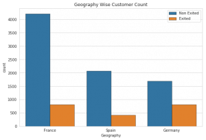
We want to plot a count of customers present in each country and customers churned from the same country. In order to do that we plot a count plot.
The above plot is a Seaborn count plot which is used to count the number of nested variables. The “Geography” feature indicates the geography of a particular customer and the “Exited” feature tells us if the customer is churned or not.
Here we can notice France and Germany have the maximum number of customers as compared to Spain and the maximum number of customers churned are from Germany.
Plot: 2
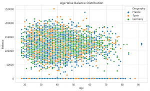
A great way to visualize the relationship between two continuous variables is a scatter plot.
Here we’ve plotted a scatter plot that shows the “Balance of customer” according to “Age of customer”.
But we can see there isn’t any correlation between Balance and Age in customers since points are scattered all over the graph.
One interesting fact that we observe is that France and Germany have accounts with 0 balance amounts. This is really ironic because Germany has the maximum number of churned customers.
So this observation invalidates the hypothesis that customers with 0 account balances are most likely to leave the bank.
Plot 3:
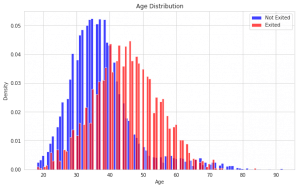
I have written a custom function named distribution(‘category’). This function takes input as a feature name which plots the histogram of the distribution for that particular feature with respect to the exited feature.
Plot 3 is plotted using the function distribution(‘age’) which plots a graph with respect to customer exited or not.
The X-axis indicates the range of age and the Y-axis indicates the density of customers leaving from that age group.
The blue bar represents customers who stayed at the bank. The red bar represents the customer’s exit from the means left the bank.
The above histogram shows the age distribution according to the customer who stayed and left the bank. Here we observe 2 trends-
1) The number of customers in the bank decrease as the age increases.
2) After the age of 40 there is an increase in the rate of customers leaving the bank. The reason for this may be that other competitor banks offer better incentives.
Plot 4:
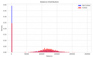
Again, we have plotted a Balance distribution using the distribution(‘Balance’) function.
In the plot above we can see that the distribution of balance for the customers who left is normal.
Also, for the customers with 0 bank balance, there is a hike in density- 24% for the customers who left and 39% for the customers who stayed.
Plot 5:
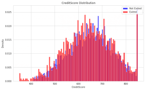
We wanted to check if there is any relation between CreditScore and the customers who stayed or left the bank. In order to do that, we plot a CreditScore distribution using the same function distribution(‘CreditScore’).
Here we see that there isn’t any pattern in the customers who left, but there is a pattern in the customers who have a Credit Score of less than 400 and it’s observed that they are leaving..
Plot 6:
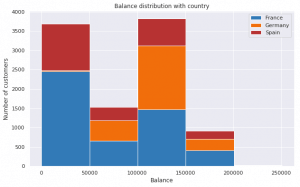
The plot above shows the Balance of customers of different countries.
In the first bar, you notice, It contains the customers who have a balance between (0 – 50000). France has the highest number of customers and then comes Spain and Germany have very few customers in this segment.
In the third bar, you notice Germany (100000 – 150000) has the maximum number of customers.
Based on the above plot we can conclude that the accounts from Germany are very rich as compared to the other two countries. But if you see Plot 1 then you’ll understand the maximum number of customers leaving the bank are from Germany.
On this note, we can infer that Germany has multiple banks which offer better incentives to the customers as compared to ABC Bank. That’s why a number of customers are moving out and opting for other banks. We don’t have data on other banks so it’s better we speculate.
Plot 7:
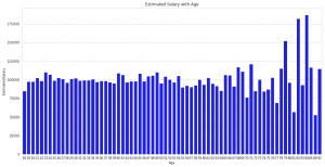
Generally, it is observed that as age increases, a person’s salary increases.
To check this assumption we have plotted the estimated salary with age. If we see the plot then we can observe that our assumption is wrong.
A weird pattern that we see is that after the age of 81 there is a rise in salary which goes above 175000. That may be because customers are generating income from their late-blooming sources like businesses and investments.
Final Consideration
EDA is the best way to understand and summarise the characteristics and behavior of the data.
We can use plotting techniques to validate the hypothesis which is made about the data. EDA also helps us to understand which model will fit the best predictions about the data set. It reduces our efforts at the time of machine learning model building.
If you want you can glance through my Jupyter notebook here, it contains the full code, graphs, and explanation.
